Confluence Overhaul
I overhauled a Fortune 25 healthcare company's design team Confluence, rebuilding the information architecture from scratch to serve both daily users and new hires learning about the team
company
Fortune 25 Healthcare
Company
ROLE
UX Researcher,
UX Architect
team
Design Operations team
timeline
May - Aug 2024
12 weeks
🌿In a nutshell…
Problem: A Fortune 25 healthcare company's Confluence directory structure for the Design Org is difficult to navigate, for finding resources and past project information
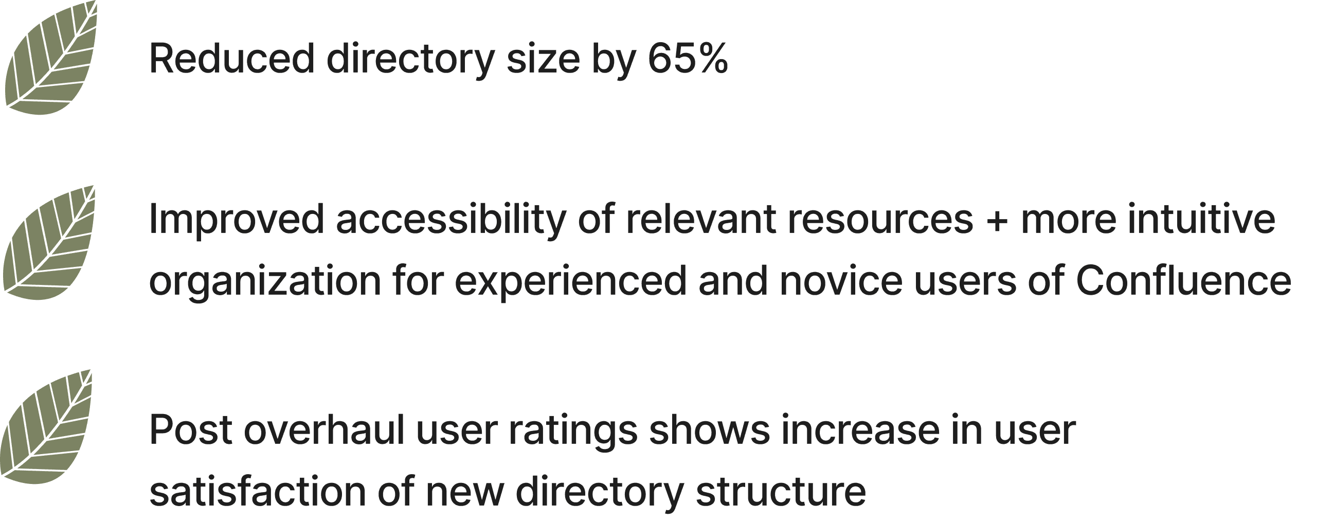
Impact: I reduced a Fortune 25 healthcare company's design team Confluence by 65%, improving navigation confidence from 2.38 to 3.13/5
Problem description
How can we redesign Confluence's information architecture to ensure intuitive organization, clarity and better alignment to employees' needs to reduce confusion with better user experience and accessibility with the space?
Project Goals
The directory structure should make it immediately obvious what the Design team does and where to find it — for both daily users and people outside the org visiting for the first time
Navigation should feel intuitive enough that employees can find what they need without asking a colleague or guessing which folder it lives in
The structure should reflect how the team actually works — organized around the disciplines, projects, and resources that matter to the people using it every day
Research and Design Process
Conducted interviews to understand primary use case for our Confluence space + pain points
Satisfaction survey to gather quantitative data on different components of Confluence
Used UserZoom to test navigation of structured proposals based on initial insights
Did A/B testing to find best proposal that met user needs
Had a conversation with UX managers to figure out the best method to organize projects in Confluence space
Visual landing pages
Communication with design organization
Content migration
Post satisfaction survey
Part 1: Initial Insights
Survey — I used a modified SUS Questionnaire rather than a custom satisfaction survey because it gave me a standardized baseline I could compare against post-launch results — making improvement measurable rather than just qualitative. 21 responses were collected via UserZoom.
The results painted a clear picture of a space that was functional but frustrating. Employees used it frequently (avg. 4/5) but found it poorly organized (2.33/5), hard to navigate (2.38/5), and unnecessarily complex (3.67/5). Confidence in using the space was middling at best (3.33/5).
If you would like to view the questions with its respective average ratings, contact me.
Insight Results
Organization is a challenge
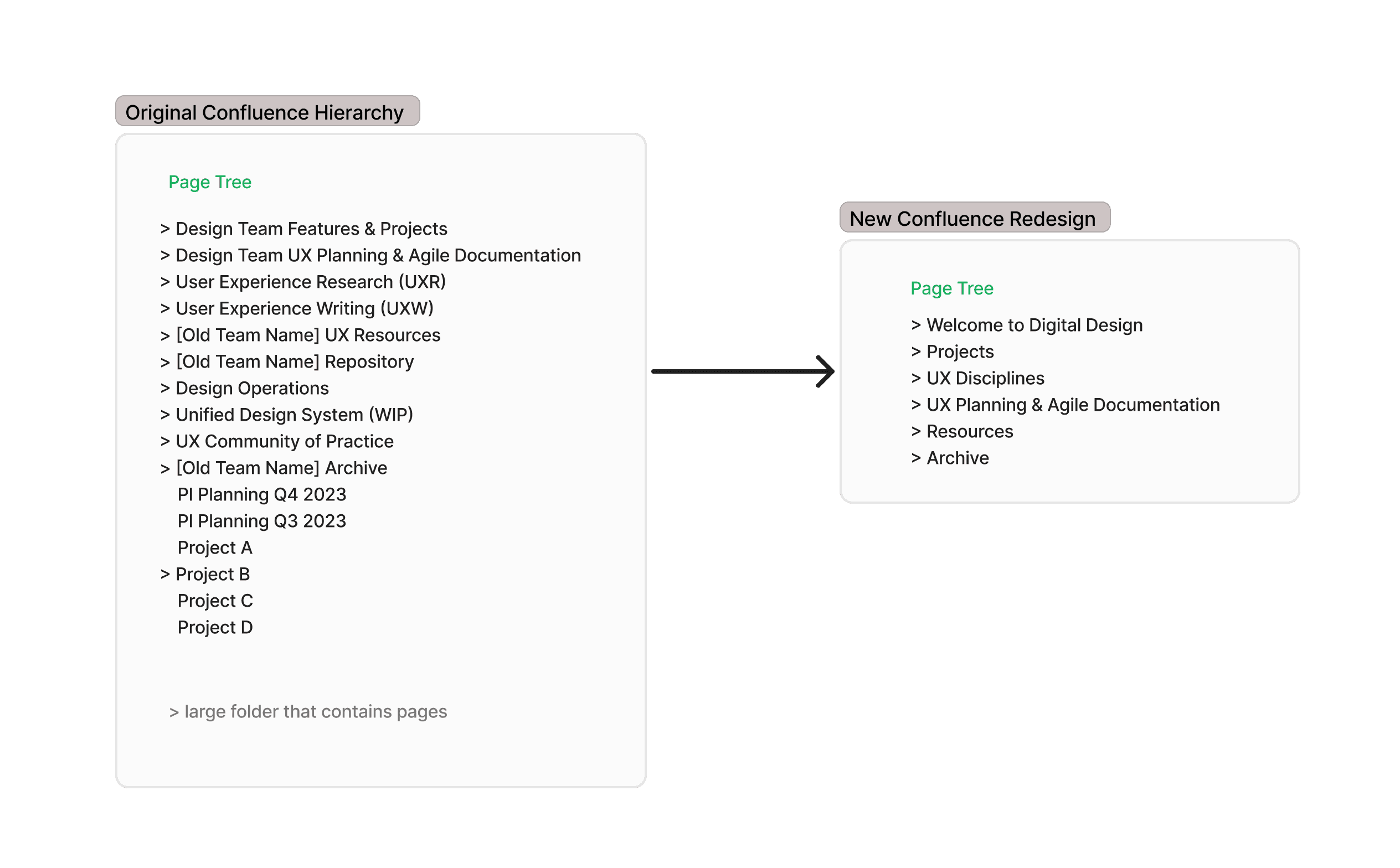
87.5% of interviewees used the word "unorganized" to describe the space. Pages were inconsistently tagged, parent directories were non-uniform, and 50% of employees defaulted new pages to the bottom of the tree instead of filing them correctly
Lack of Visual Appeal
Confluence was built for developers, not designers — and the older version we used had limited visual capabilities. One particular visual I discovered during research became the inspiration for the landing page designs in Part 5
Existing folders not meeting user needs
Old, unused archives cluttered the directory and made it harder to find relevant content. UX Designers specifically noted there were no folders to house design briefs or resources, so content had nowhere logical to live
Lack of onboarding information
New hires felt lost — there was no clear starting point for learning about the Design team, no admin policies, and no explanation of how their role fit into the larger organization. Onboarding content was previously on Trello, but an expiring license made migrating it to Confluence a priority
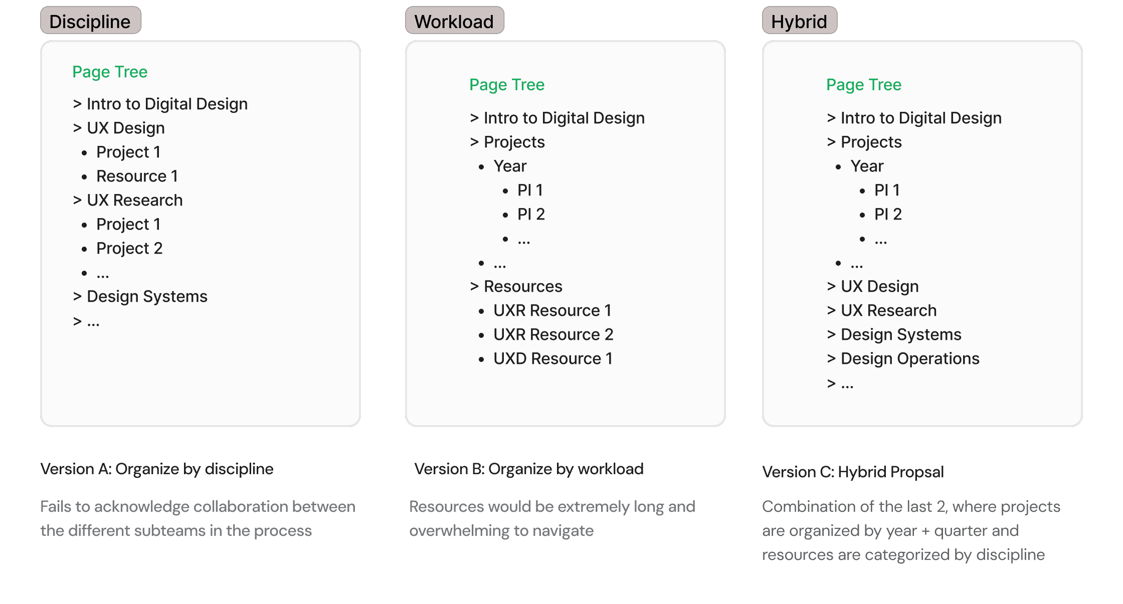
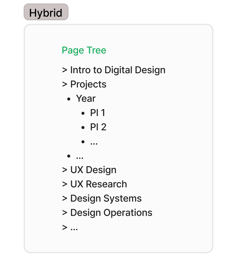
Part 2: Tree Testing
I tested three structural proposals with employees across different roles to find which felt most intuitive to navigate. I chose the hybrid proposal because it balanced two needs that the other versions handled separately — organizing by discipline and by workload — without forcing users to choose one mental model over the other.
Testing ran in two moderated rounds. Round 1 used manual FigJam testing; midway through I switched to UserZoom after a colleague's suggestion, which significantly improved the reliability of the data.
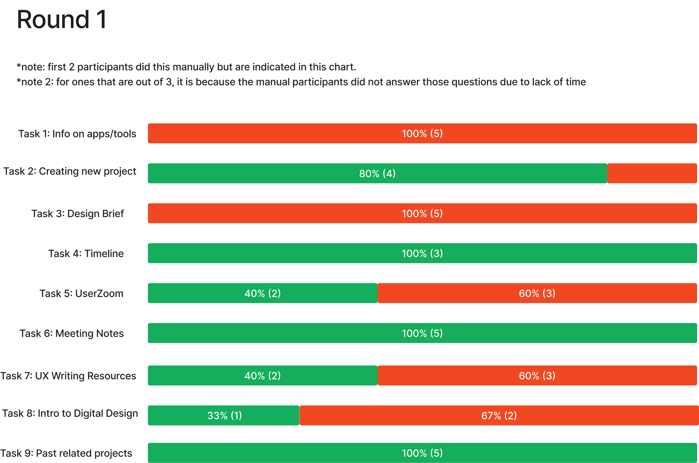
Round 1 surfaced two main issues: confusion between "Resources for Digital Design" and "Tooling and Enablement," and a need for deep linking since some content logically lived in more than one place. I resolved both before Round 2
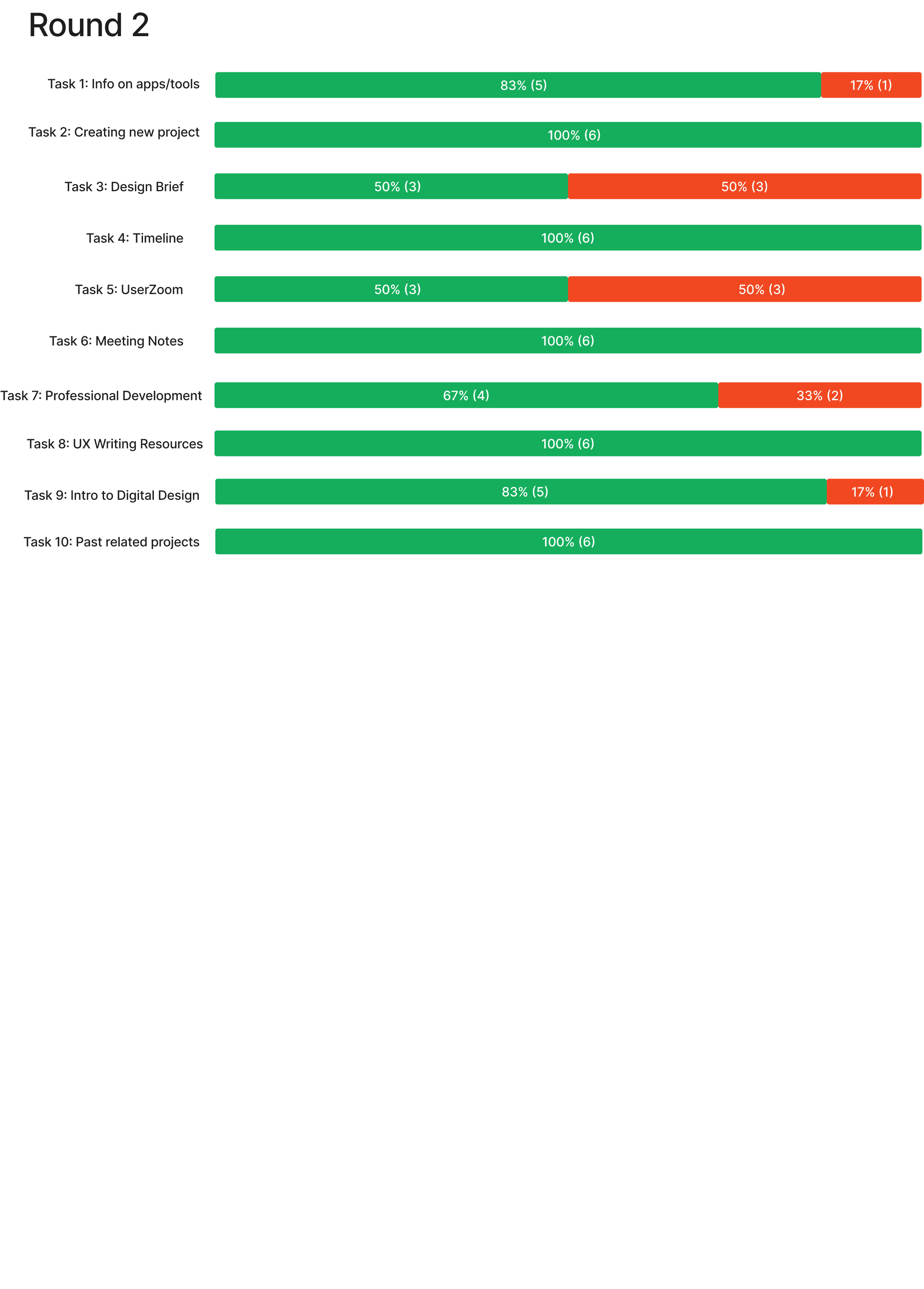
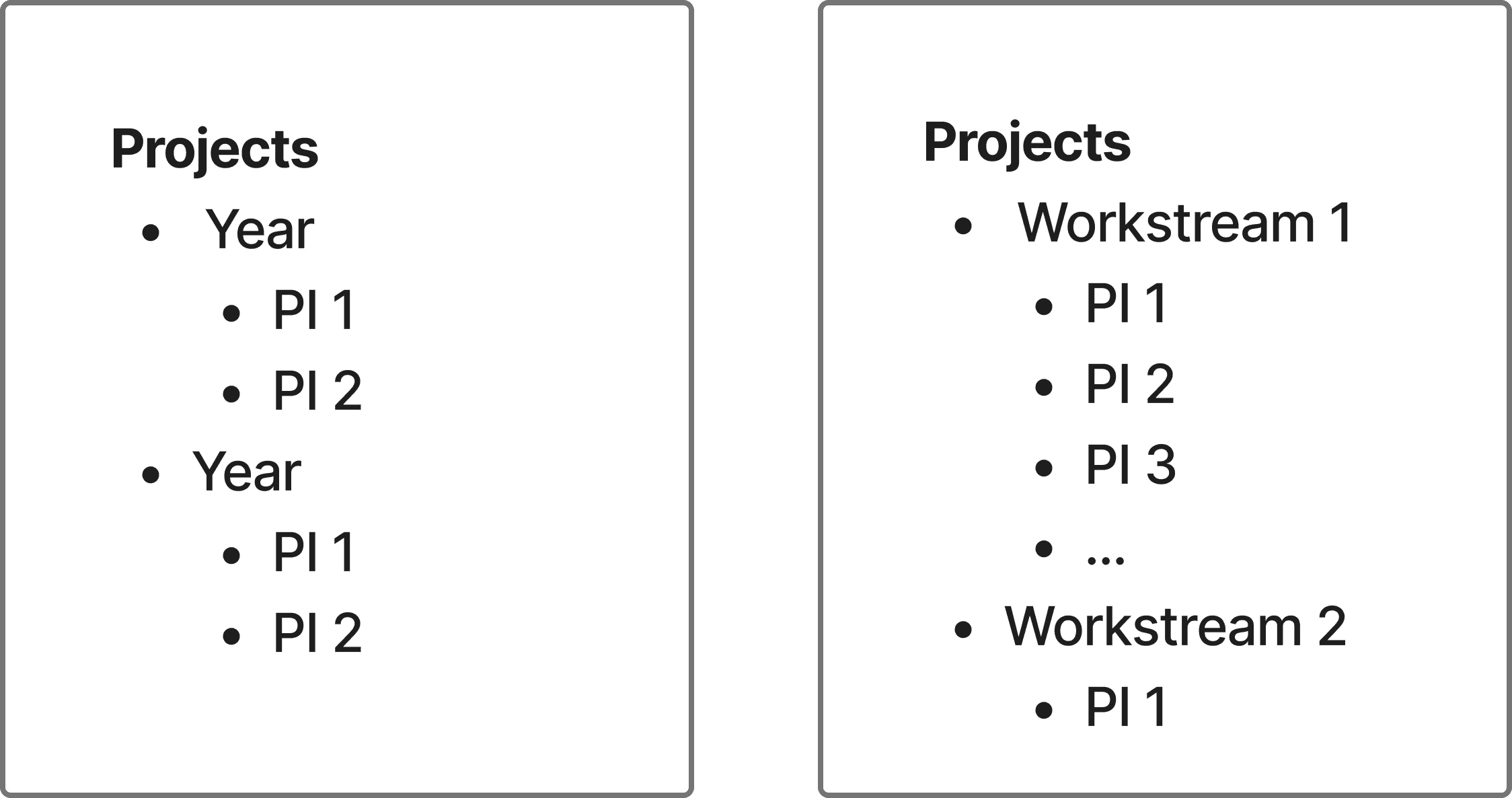
83% of Round 2 participants successfully navigated at least 8 out of 10 tasks — a meaningful improvement. The one persistent challenge that data alone couldn't resolve was the projects section, which led directly to Part 3.


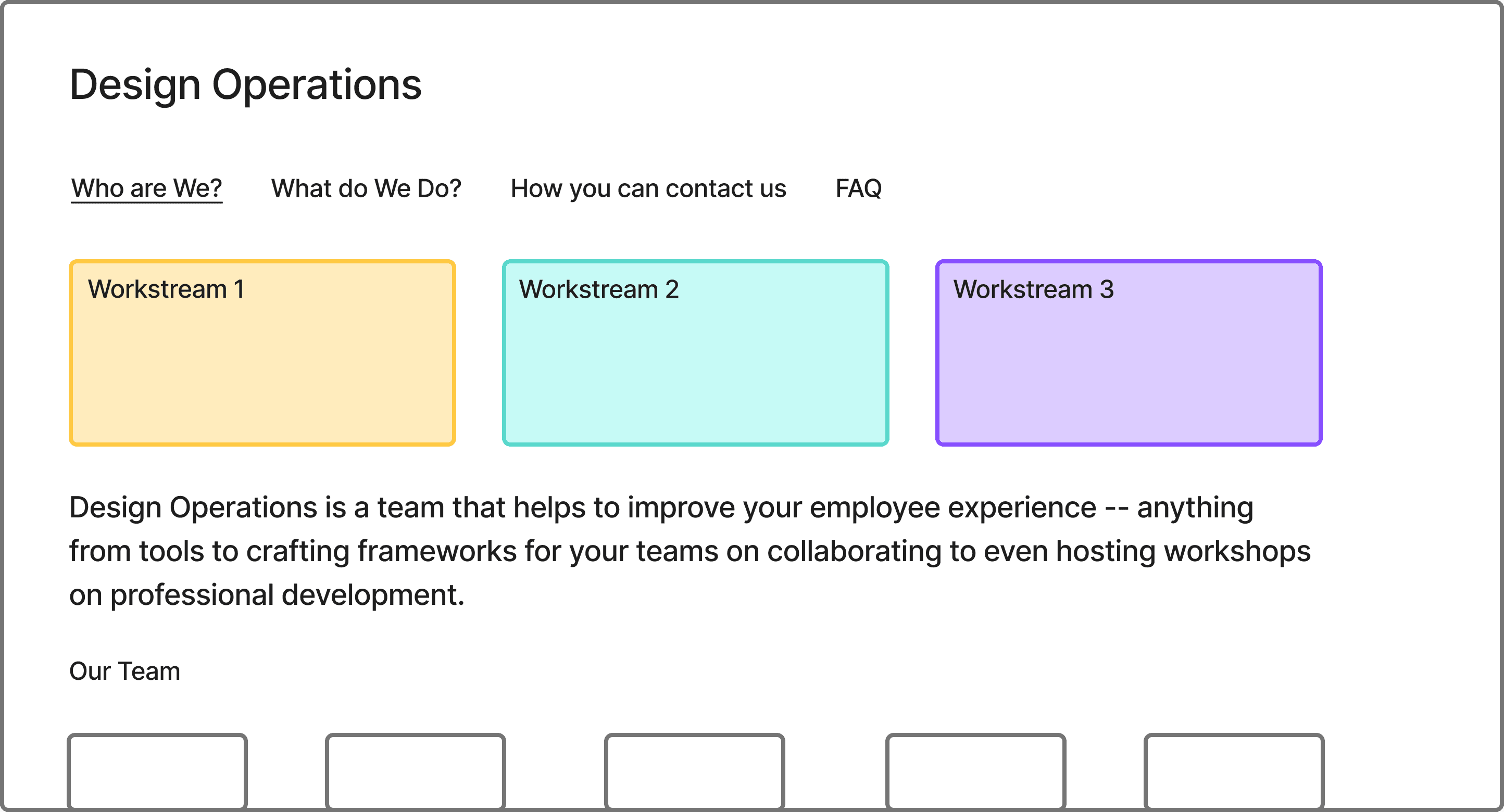
Part 5: Visuals